The Art and Science Behind Todoist: Crafting the Ultimate Productivity Companion

In today's era, where diversions are merely a tap away, maintaining productivity often feels like navigating through a challenging obstacle course. Within the vast landscape of productivity platforms and applications, Todoist stands out as a beacon for those devoted to enhancing their efficiency. Its elegant design, user-friendly interface, and robust functionalities distinguish Todoist as not just another tool, but a vital companion for countless individuals aiming to streamline their daily tasks. This article explores the thoughtful design principles and customer-focused features that have transformed Todoist into the ultimate task management app, shedding light on why it has become an essential tool in the arsenal of those looking to improve their productivity.
Introduction to Todoist's Design Philosophy
At its core, Todoist's design philosophy is anchored in simplicity, flexibility, and reliability. These three pillars serve as guiding principles in the app's development, ensuring that while it remains feature-rich, it does not overwhelm the user. In an era where digital tools can often become bloated with unnecessary features, Todoist's approach is refreshingly minimalist, focusing on what truly matters to the user: getting things done.
Simplicity and Clarity

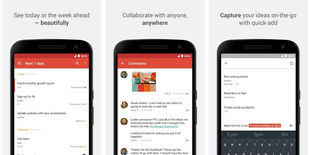
One of the first things users notice about Todoist is its clean and uncluttered interface. This simplicity is by design. The Todoist team understands that a to-do app should not add to the user's cognitive load; instead, it should remove it. Every element and color used in the app is chosen with care to ensure it contributes positively to the user's experience, enhancing focus rather than detracting from it.
Flexibility to Match Your Workflow
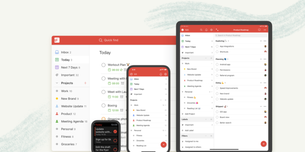
Recognizing that no two users work the same way, Todoist has been built with flexibility in mind. Whether you're a fan of the Getting Things Done (GTD) methodology or prefer to craft your system, Todoist's features, such as task prioritization, labels, and filters, can be tailored to fit your unique workflow. This adaptability makes Todoist not just a tool but a productivity partner, capable of evolving with your changing needs and habits.
Reliability: The Foundation of Trust
At the heart of any productivity system is trust. Users need to know that their tasks and data are safe and that the app will function seamlessly across all their devices. Todoist has earned users' trust through its commitment to reliability. Regular updates, seamless synchronization across platforms, and robust data security measures ensure that Todoist is always ready and responsive, providing peace of mind for its users.
User-Centric Design Considerations

Todoist's success is not just a product of its features but also its user-centric design philosophy. Every decision, from the overarching interface to the smallest icon, is made with the user's experience in mind.
Intuitive Interface
Todoist's design seamlessly merges ease of use with robust features. Its user-friendly design makes it approachable for first-time users and yet remains deeply functional for those who need more advanced options. One standout feature is its natural language processing, enabling users to effortlessly create tasks in their own words. Additionally, the omnipresent quick add feature ensures that no matter where users find themselves within the app, adding a new task is always just a click away.
Personalization and Customization
Understanding that personalization is key to a tool's adoption, Todoist offers various customization options. Users can choose themes to match their aesthetic preferences, organize projects in a way that makes sense for their work and life, and even integrate with other tools they use, making Todoist a central hub for their productivity needs.
Accessibility and Inclusivity
Todoist is designed to be accessible to as wide an audience as possible. This includes considerations for users with disabilities, offering features like keyboard shortcuts, compatibility with screen readers, and options to customize text size and contrast. By prioritizing accessibility, Todoist ensures that productivity is attainable for everyone.
Conclusion: The Essence of Todoist's Success

The anatomy of the perfect to-do app, as embodied by Todoist, is a blend of thoughtful design, user-centric features, and a philosophy that places simplicity, flexibility, and reliability at its core. Its design doesn't just cater to the needs of its users; it anticipates them, creating an environment where productivity can flourish. As we've explored, Todoist's success lies not just in what it does, but in how it does it—through a commitment to an intuitive, personalized, and inclusive user experience. Whether you're a seasoned productivity guru or just starting your journey towards better task management, Todoist stands out as a beacon of design excellence, proving that when it comes to productivity, the right tool can make all the difference.


Leave a comment